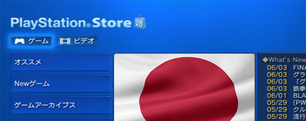
Japanese PSN Store Gets A Make-over
Posted by Chris K on September 2nd, 2010 | 0 Comments | Tags: JP Store
So I was doing my usual check of the Japanese Store last night when I noticed the layout had changed. I for one, really like this new look, even if it make finding the new stuff a little more tedious.
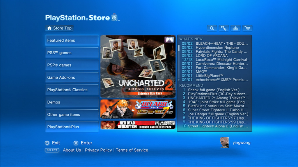
That is what the store used to look like (Pictured below is the Hong Kong store, which still has the old layout).
There was a section on the right for new releases and then a top 10 or recommended list. The side bar was just the average stuff like we have on the US or EU Store.
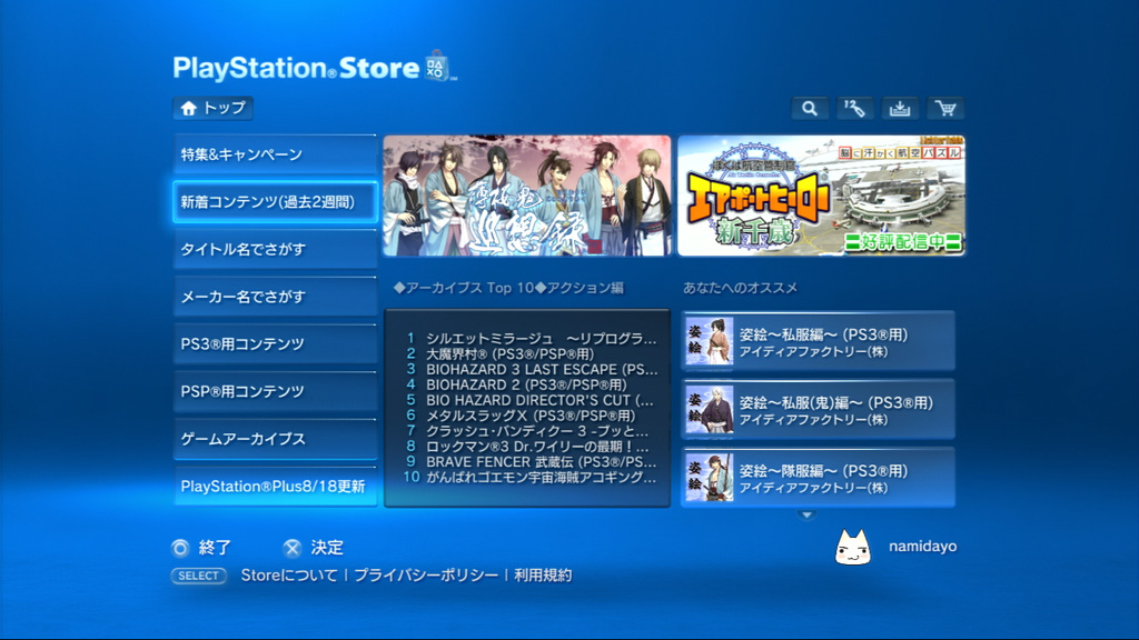
Now here is what the Japanese store looks like now.
As you see the 3 middle ads have been shifted up and have be reduced down to 2 evenly sized ads. The Top 10 list has shifted over to the middle and next to it is a new list. The “Recommended For You” list contains items which you make like based on your purchase and download history. There is still the “You May Like” section when you dig into the tabs on the side but this is a little different.
There is no word on whether the other stores will be getting updated like this, but I will be sure to ask. So are you a fan of this new layout?

